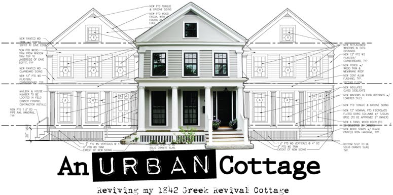

Imagine coming home to find this. I wasn't ready for it and I'm quite sick to my stomach at this moment.

The whole front of the house is stripped to the sheathing except up on the pediment...and my little test area for the new paint colors. I'm seeing the colors for the first time out from under the cover of the porch and I still love them.

I was hoping to see the clapboards underneath the shingles to see the outline of the original porch. Jared said the entire front was covered in clapboard so he ripped them off. So either they weren't the original clapboards or the clapboards were filled back in after the porch was removed.
170 years peeled away in 2 days.

This dark line just below the upper window is the only evidence of the angle of the original porch roof we can see.

A view of all the layers still visible at the front corner.

This fence post was originally tight to the vinyl siding. Can you imagine the weight of all of that material on the house?
I think she's breathing a big sigh of relief.
 I got a few questions about the colors so I thought I'd share that. Here are a bunch of the colors I considered. I'd read a lot about Martha Stewart's Bedford Gray being a "nice neutral gray" so I went to Home Depot to get her color palette, not that I would use her paint (sorry, Martha) but I could at least use the color chip to match it to something in the Ben Moore fan deck.
 I have to admit, the woman has some really beautiful colors in her palette. Maybe I could give it a try in one of my bathrooms or something. Each color card has two coordinating colors on the back that you can fold over to see what they would look like together. I think that's a really, really smart idea.
 Here's Martha's house painted in her Bedford Gray. I think it's kind of a beige gray. There are some other nice grays like "Cement" "Zinc" and an almost-black brown gray called "Seal" that I think would look great in lieu of a true black accent.
 Here's Martha's house painted in her Bedford Gray. I think it's kind of a beige gray. There are some other nice grays like "Cement" "Zinc" and an almost-black brown gray called "Seal" that I think would look great in lieu of a true black accent.
Long story short, I thought more of a browny gray would be safer and after narrowing those down, I chose the following Benjamin Moore colors:
House body: Graystone #1475
House trim: Silver Chain # 1472
Porch ceiling: Clear Skies #2054
Door: Black #2132-10 (and eventually the shutters)
I've chosen the black color so it matches the window mullions but there's a color called "Dragon's Breath" #1547 that's a really dark brown/almost black that I think would look awesome. Until I get the windows, I can't really make that decision.

Here's a photo I found, maybe on Flickr, of a room painted the "Graystone" color. If it's possible, I think it looks both modern and historical at the same time.
That's it for today.
Oh My! Just remember she has to look bad before she can be beautiful.
ReplyDeleteI can't believe all the layers! It's got to feel so much better knowing they're all gone.
I love the colors you chose. I never thought about the paint taking on a different hue when next to the yellow. Smart thinking because that would be a hard lesson learned if every time you walked by, you saw purple!
Your black door is so pretty with the grey but I bet the deep brown is gorgeous...is it like a dark walnut?
Brace yourself for tomorrow when you get home from work! :)
Wow, your poor house! I know it will look great in the end though. I love the gray you picked out too.
ReplyDeleteIt must be scary! Just keep looking at the paint swatches and imagining the end result. I know it'll be a beauty with your attention to detail!
ReplyDeletehi steve,
ReplyDeleteif i came home from work and saw that mess, i'd be in heaven. i'm borderline addicted to demo and maybe even a little chaos.
love the color selections and that sweet little bathroom.
~janet